Recirc UX Design and Usability Testing

Taking Recirc From Concept to Prototype

In 2016 I cofounded Recirc, a pre-development peer to peer item rental platform. My first goal was to display our product vision as a clickable prototype we could use for fundraising and usability testing. Eventually when we started development, I acted as the project manager and used this prototype to help communicate our vision to an off-shore team of developers.


High Level Renter Request Flow

In its early stages, the Recirc prototype included 71 screens across just two primary flows – one for item owners listing their items for others to rent, and another for item renters renting those items for their own use. For each, I created high-level user flows in a simple workflow diagram. 

Sample Screens from Marvel App Prototype (Renting Flow)

We started with a mobile prototype both because we envisioned Recirc as a mobile app and because we appreciated the benefits of the mobile-first approach for design. Without much prior experience designing mobile screens however, this took many rounds of iteration and I leaned heavily on usability tests and resources like Nielson & Norman Group’s usability text books

High Level Owner Item Listing Flow

Sample Screens from Marvel App Prototype (Listing Flow)

Adapting Our Mobile Prototype For Web Development.

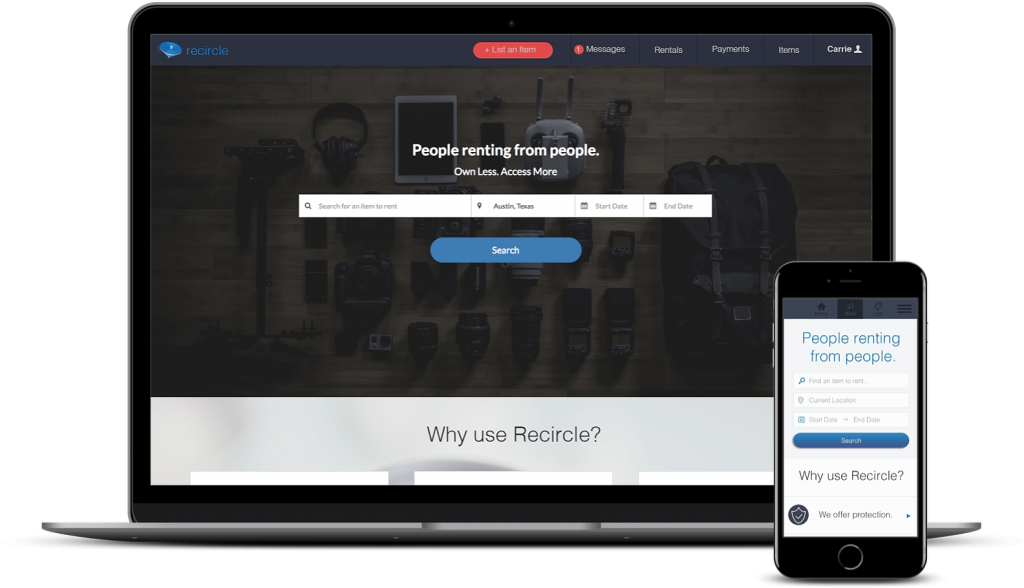
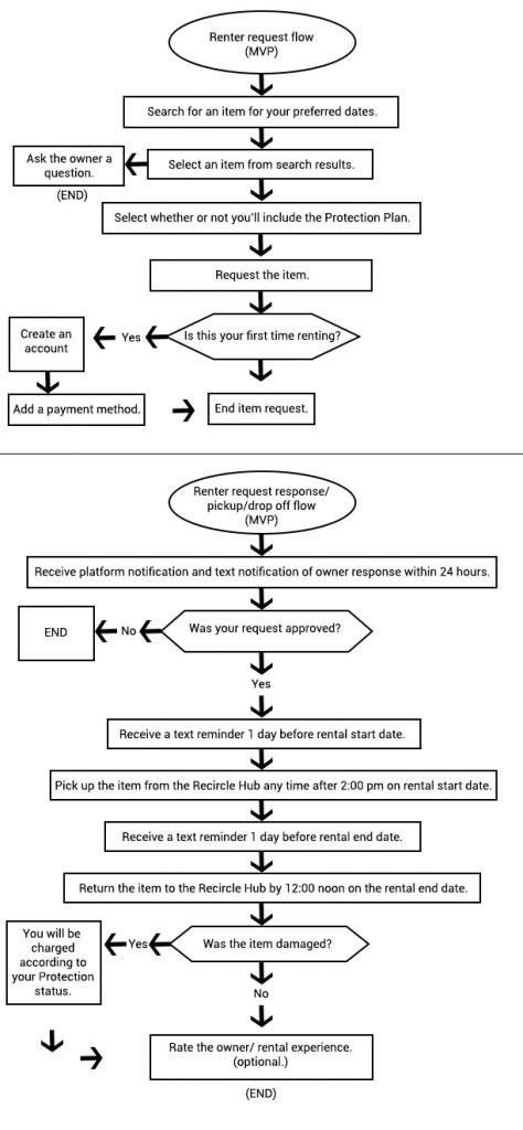
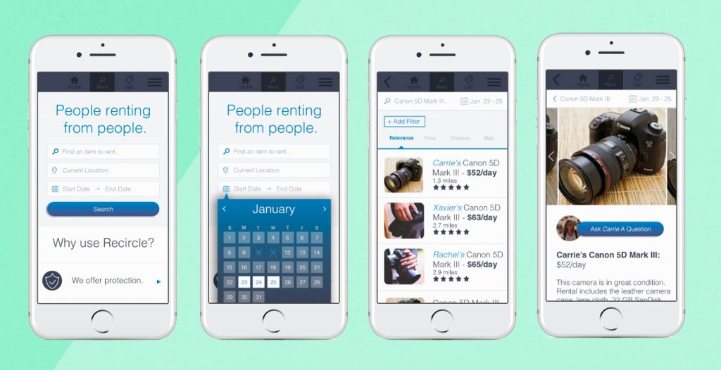
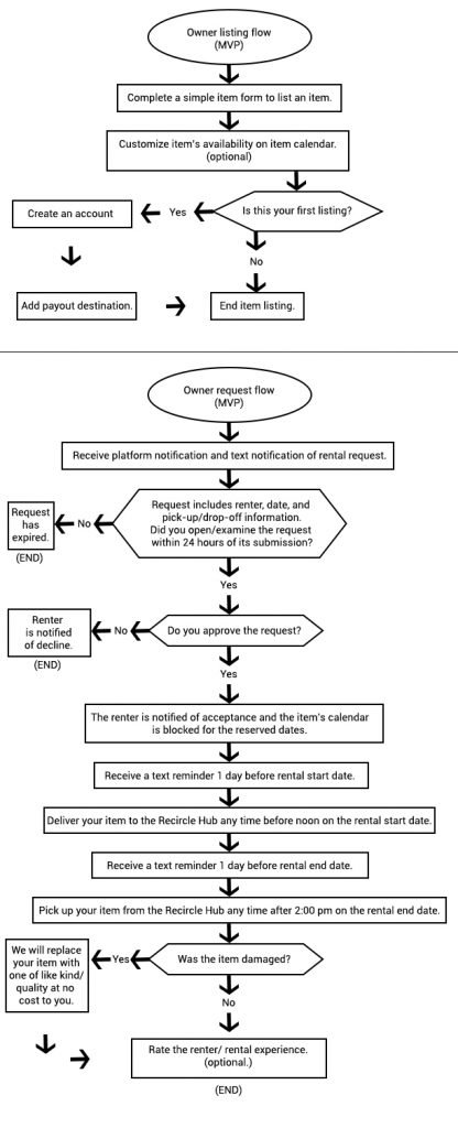
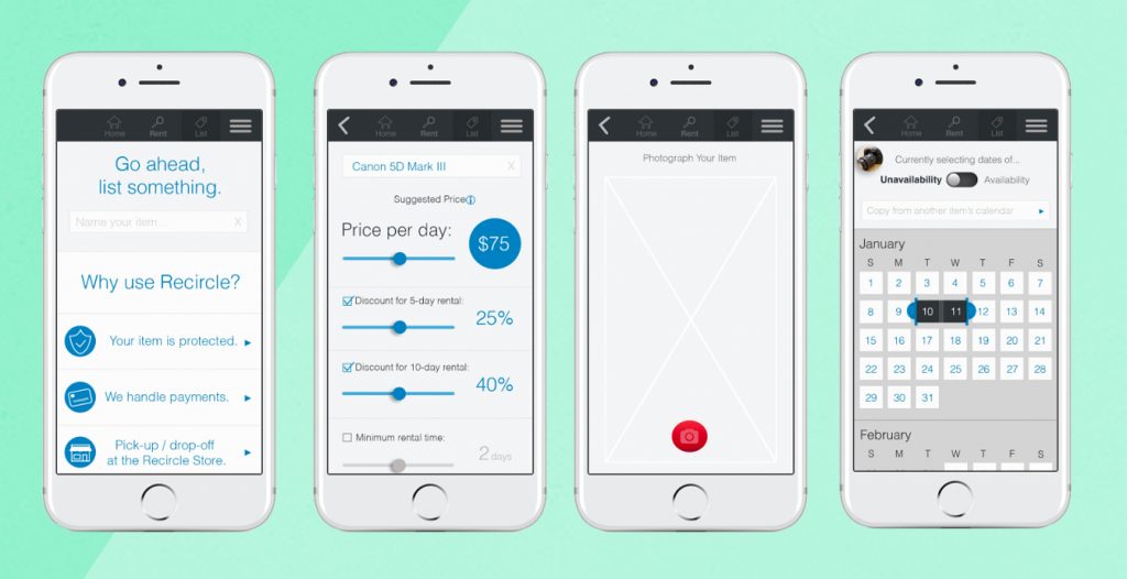
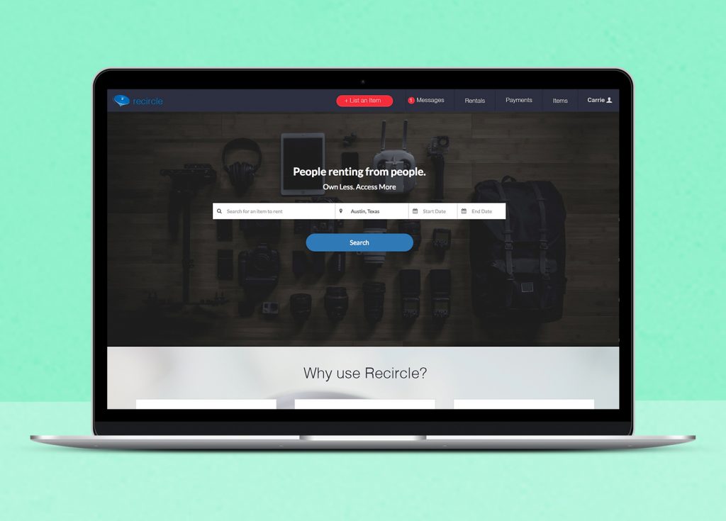
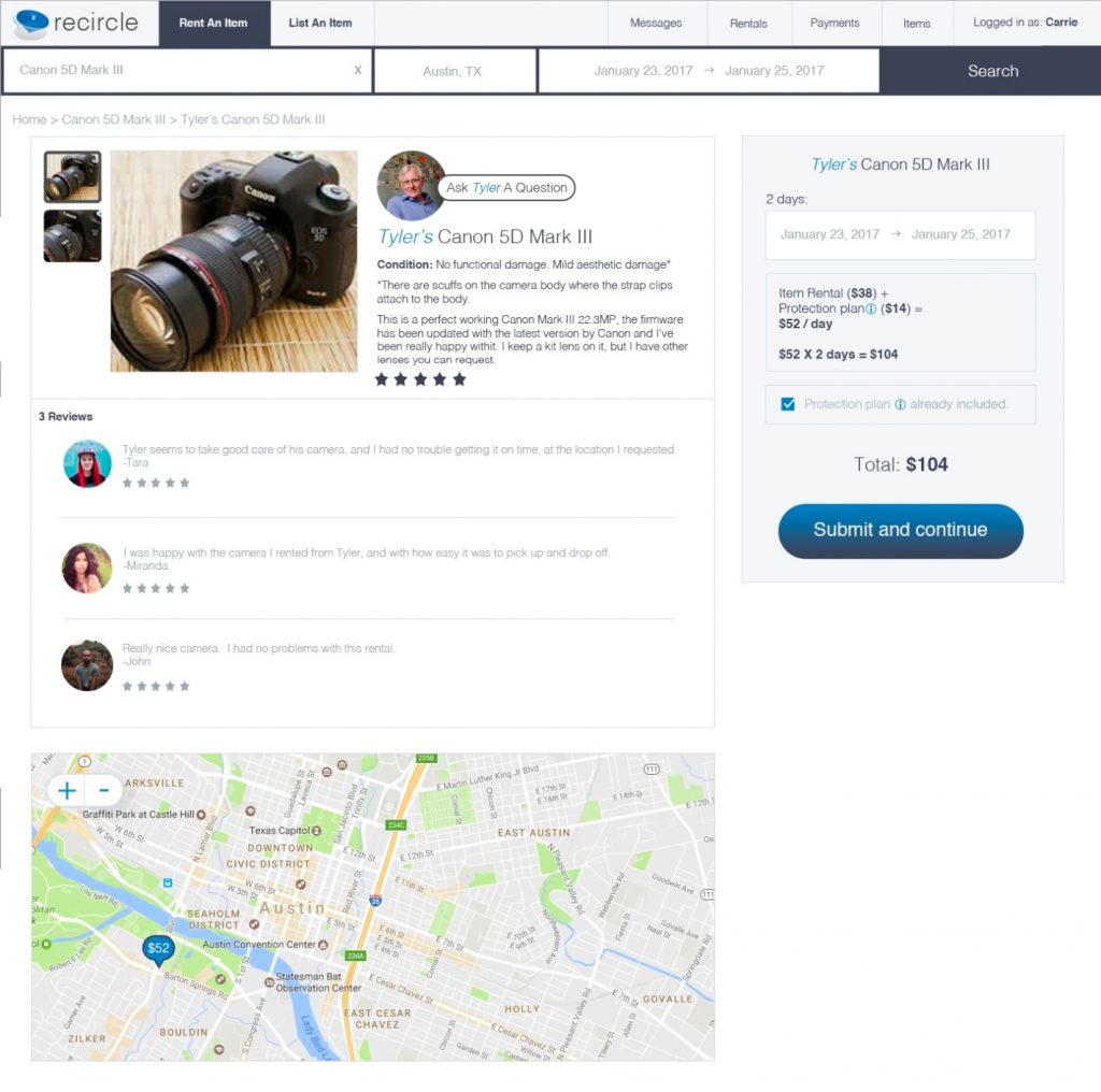
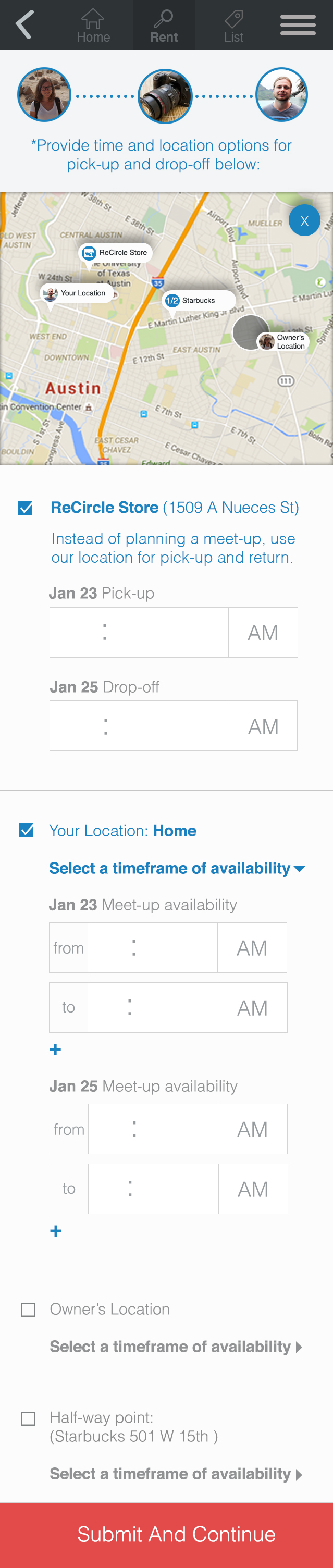
As the project manager for development, I worked closely with our team of 6 designers to build the MVP version of Recirc. For this stage of development, I adapted my mobile screens for web, according to our MVP plan. 

Our development team included a seasoned and talented UX designer whose expertise gave me profound new lessons in usability design. 

As with the mobile prototype, I continued to conduct usability tests to guide my iterations. I followed guidelines set out by usability experts Steve Krug, Jakob Nielson, and Don Norman, designing user tasks and questions which were not too leading, allowing me to observe the “trips in the carpet”.

Below is an example of how my designs progressed based on user test observations, user feedback, and collaboration with the designers on our development team. 

Item Selection Web Iteration 1

Item Selection Web Iteration 2

The most challenging flow within our early concept included a meet up option for item pick up and drop off. Our goal was to allow renters to approve 1-3 meet-up possibilities including the renter’s location, owner’s location, a public half-way meeting spot generated by the app, or the Recirc facility. Then, we asked the renter to provide time ranges of availability for the pick up and drop off days. This information would be passed along to the owner who could then commit to a time and location within the renter’s submitted parameters.

This flow was especially challenging because of its uncommon use in existing platforms. At this time, there were no other platforms accommodating meet-up arrangements, so our users would be leaning entirely on the user interface to guide them. I conducted nearly a dozen usability tests around this flow alone. Based on these usability tests I learned that having the location selections interspersed with the time frame selection made users uncertain what they were looking at. It also became clear that users did not understand the Recirc Store as a way to avoid a meet-up, even when copy was provided to explain this. In the second iteration, we organized the tasks as two clearly separate tasks – location selection and time selection. 

Item Pick-up/Drop-off Arrangements (Iteration 1)

Item Pick-up/Drop-off Arrangements (Iteration 2)

Recircle Branding Iterations

Before launch, our team spent a lot of time brainstorming about our branding and logo. As part of this process, I created more than a dozen logo concepts centering around circular or cyclical imagery. We wanted to imply the continued life cycle of the items we own. At this time, we were using the name “Recircle”.